Fruitful
An original conference with a focus in design & identity
Role: Designer, Copywriter, Illustrator
Responsibilities: Ideation, Research, Copy, Brand Identity
Result: Conference Poster, Booklet, Additional Marketing Assets
Tools: Adobe Indesign, Adobe Illustrator, Procreate, Hand Sketching
Fruitful discusses various underlying issues among women’s reproductive health rights. Being run by a female team, this conference looks to inspire and educate individuals on subjects ranging from the pink tax, reproductive safety, to how men can be allies. As of 2020, women around the globe are still fighting these injustices. In an age like today, people are not afraid to exercise their voices, spread awareness online, and have difficult conversations. A conference like Fruitful not only provides females who have been fighting this battle longer than most a platform to teach, but an empowering atmosphere where others can find their stand.
Problem
The conversation surrounding the policies and law created for women’s health, and women’s health as a whole, continue to be a struggling topic for people. Sub topics, like sex education are commonly uncomfortable for many individuals, leading to other topics about women’s health to be swept under the rug.
Many individuals are also simply either uneducated or poorly educated on the subject. This being said, providing a place where people from all backgrounds can better their knowledge of these unwieldy issues, will lead to further understanding and advance change in a positive way.
Solution
Establishing a conference was my solution to these difficult conversations. Fruitful worked to create an inclusive atmosphere where both females, males, young, old, and people of color feel welcome. In doing so, Fruitful gathered together brilliant minded women of many backgrounds, cultures, and educations to speak at this conference. Additionally, the conference includes an array of informative sessions where an audience member is bound to find at least one intriguing and insightful.
Design Process

Naming
It was important for the name of the conference to not only evoke a sense of curiosity but embody the mission. When a person hears “fruitful” they instantly know they will be having insightful interactions and engaging in strong discussion. This name also is defined as bearing fruit, or the ability to produce, such as women. These definitions strongly coexist and express the goal of the conference.
Logo Development

Hand Sketches

Digital Ideations

Final Mark Up
Color Palette
Peach tones, cocoa brown, with a hint of lilac. These are the colors of Fruitful. Lilac represents the elegance and calming essence of a female, while the soft cocoa brown showcases the beauty of underrepresented skin tones. The bright coral adds a punch, demonstrating the confidence and power every woman holds.

Typography
The typefaces chosen not only provide clean and clear legibility, but have a professional appearance with a feminine touch. The round and softness of the chosen type exhibit similar features to a woman’s curves and all body types.

Outcome
Poster
This poster was intended to catch the viewer’s eye with a bold graphic as the first read, and a form of juxtaposition with the soft, feminine elements and color palette.

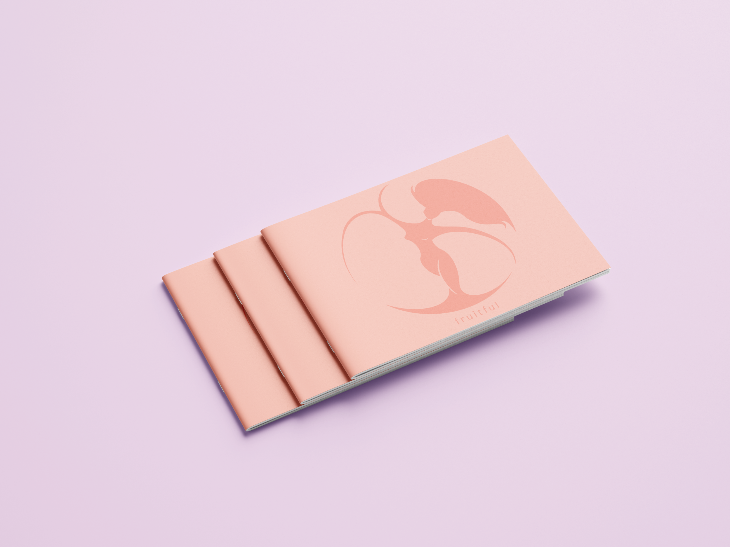
Conference Booklet
This booklet was created to hand out to all audience members of the Fruitful conference, including sessions, the schedules, and special features.